
How to Improve Your Website's Mobile Experience
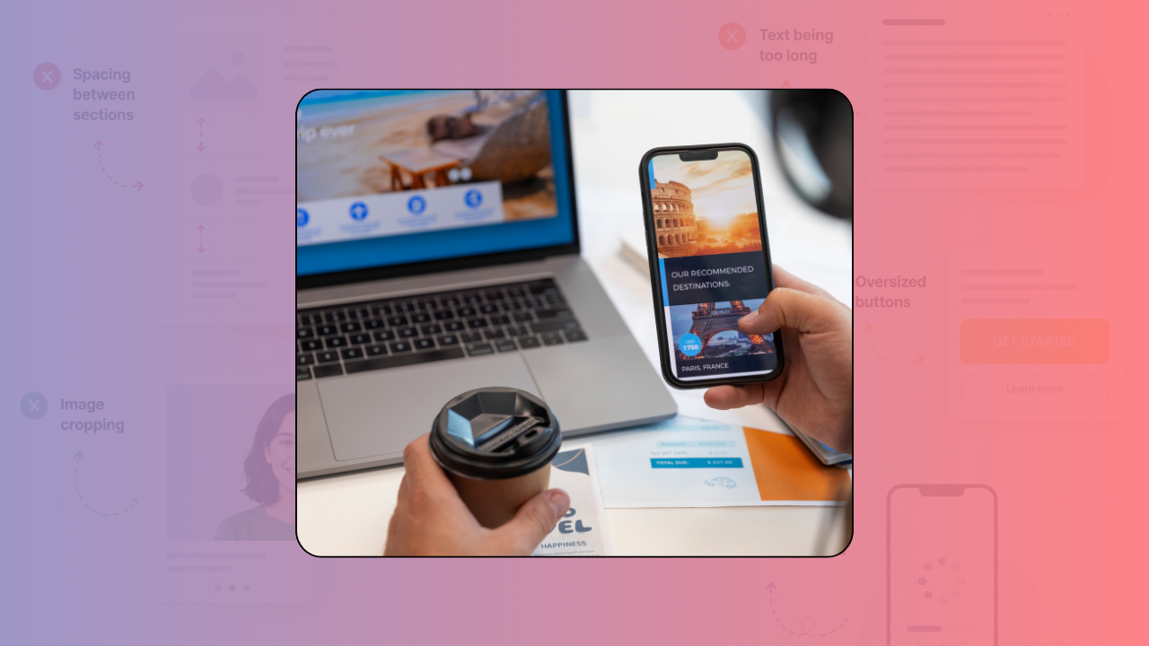
Quick question: when was the last time you visited your own website on your phone?
Not scrolling quickly. Really visited it, like a customer would.
Most creators don't do this regularly. And that's a problem, because more people visit your site from mobile than from desktop now.
If your site doesn't work well on a phone, you're losing customers.
Why mobile matters so much
Mobile is not optional anymore. Mobile is primary.
If your site looks great on desktop but clunky on phone, most people experience the clunky version.
A bad mobile experience directly impacts conversions. People bounce. They don't trust you. They don't buy.
A good mobile experience makes people feel like you care enough to get the details right.
1.Spacing on mobile
Content that looks fine on desktop can feel cramped on a phone.
Text runs together. Buttons are too small. Sections are too close.
On mobile, you need more breathing room, not less.
Headings should have space around them. Sections should be clearly separated. Buttons should be big enough to tap easily without hitting the wrong one.
2.Text that's actually readable
On desktop, 16px text looks fine.
On mobile, 16px text can be too small. Your phone's screen is smaller, and people often hold it farther away.
Make mobile text big enough that people don't have to zoom in to read it.
3.Images that don't break the layout
Images that look good on desktop can stretch weirdly on mobile.
Make sure images scale properly. They shouldn't push text off the page or create weird spacing.
If an image doesn't add value on mobile, it's okay to hide it. Mobile experience should be lean and focused.
4.Buttons you can actually tap
Buttons on mobile should be big. At least 44px tall, ideally bigger.
Small buttons are frustrating. People tap the wrong thing. They get annoyed. They leave.
Make your CTA buttons thumb-friendly.
5.Navigation that makes sense on mobile
Desktop menus with lots of options become a nightmare on mobile.
On mobile, keep navigation simple. Hamburger menu if you need to. Main links only. No hover states that don't work on touch.
People should be able to navigate your site with one hand, easily.
6.Forms that don't frustrate
Filling out forms on a phone is annoying. Long forms are torture.
On mobile, break forms into steps if you can. Ask for the minimum information. Make it fast.
Also, mobile keyboards are tiny. Make input fields big enough that people can actually type in them.
7.Load time matters more on mobile
On mobile, speed is everything. People are impatient. Slow sites get closed.
Optimize your images. Minimize code. Test your speed regularly.
A fast mobile site feels modern. A slow one feels broken.
Test on real phones
Don't just look at your site in a browser's mobile preview. Look at it on an actual phone.
Open your site on your iPhone or Android. Go through it like a customer. Click buttons. Fill out forms. Try to buy something.
You'll notice things that the preview doesn't show.
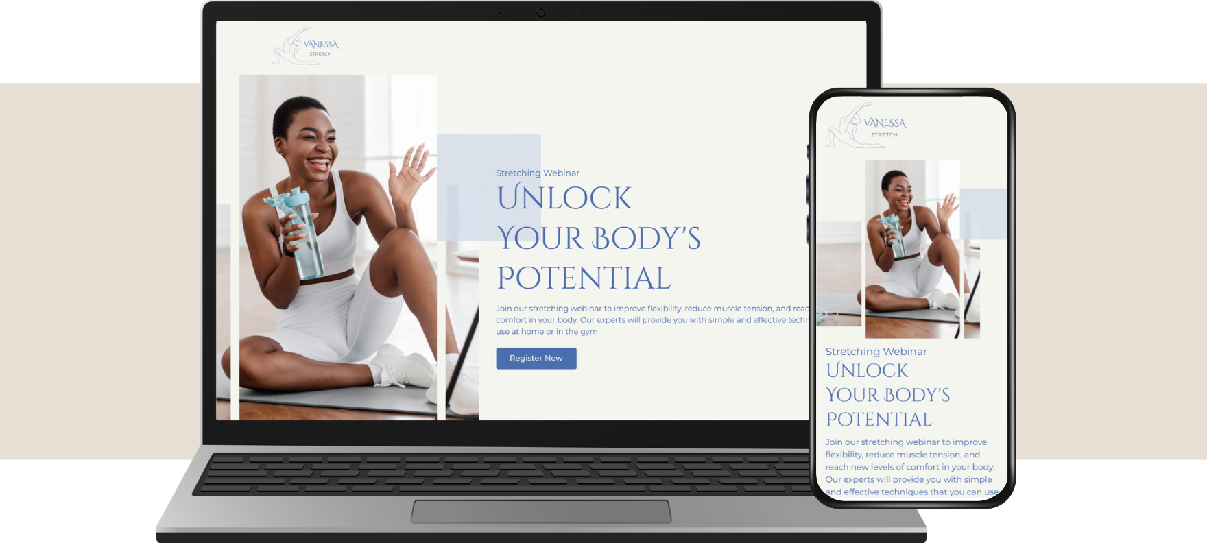
Common mobile mistakes
- Text too small
- Buttons too small
- Too much content crammed in
- Slow loading
- Auto-playing videos
- Pop-ups that cover the whole screen
- Navigation that's hard to find
- Form fields that are hard to tap
If your site has any of these, fix them. They're losing you customers.
Final thought
Your mobile experience is not secondary. It's primary.
More people experience your site on mobile than desktop. If you want conversions, you need a mobile experience that's just as good (or better) than desktop.
Spend an hour this week on your phone, visiting your site like a customer. Notice what's hard. Fix it.
If you want help optimizing your mobile experience, we can help.