
The Biggest Mistake Most Course Creators Make on Their Homepage

Your homepage is the first impression most people get of your business.
And surprisingly often, that first impression is confusing.
The person lands, spends five seconds scanning the page, and leaves. Not because your offer is bad. But because the homepage didn't make it clear what you do, who it's for, or why they should stay.
The confusion problem
The biggest mistake we see is trying to explain too much on the homepage.
People add everything: their story, their philosophy, their services, their courses, multiple offers, testimonials, case studies, the about section.
It all gets jumbled. And visitors don't know what to do next.
A good homepage is not comprehensive. It's clear.
The transformation angle
The best homepages start with transformation, not information.
Instead of: "Hi, I'm a coach and I help people with X, Y, and Z"
Try: "You want to launch your course but you're overwhelmed by technical stuff. We take care of all of that."
That's specific. That's about them. That shows an outcome.
What a strong homepage needs
A homepage should answer these questions in the first few seconds:
- Who is this for?
- What do they get?
- What's the transformation or outcome?
- What's the obvious next step?
That's it. You don't need more.
Everything else (testimonials, details, your story) can support these answers. But these four things have to be crystal clear.
The headline problem
We see a lot of homepages with vague headlines.
"Welcome to My Platform" "Empowering Creators to Succeed" "Building Amazing Experiences"
These are nice. But they don't tell me anything specific about what you do or who it's for.
A strong headline is specific and benefit-driven.
"Course creators who want to focus on teaching, not technical setup" "Coaches ready to move their clients from free content to paying programs"
These immediately resonate with the right people.
Visual consistency matters
Your homepage should look like the rest of your website. Same colors. Same fonts. Same feeling.
When the homepage looks different from your inner pages, it feels disjointed.
The call-to-action
Many homepages have CTAs that are too vague.
"Click here" "Learn more" "Start now"
These don't tell people what happens next.
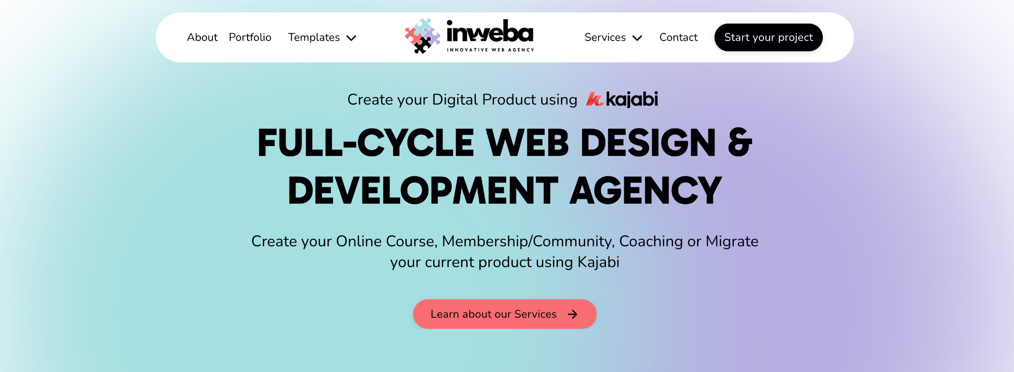
Better CTAs tell the story: "See how it works" "Start your project" "Get a free consultation"
These are specific. People know what they're signing up for.
Proof matters early
If you have testimonials, results, or logos of clients, put them early.
People are more likely to engage if they see proof that this works for real people.
But make sure it's relevant. If your testimonial is about your coaching, but your homepage is about a course, it's confusing.
What to cut from your homepage
If something on your homepage doesn't serve one of these four purposes, consider cutting it:
- Does it clarify who this is for?
- Does it show the transformation?
- Does it build trust?
- Does it guide them to the next step?
If not, it's probably distraction.
Testing your homepage
Ask a friend to visit your homepage and tell you (without you explaining anything):
- What do you do?
- Who is this for?
- What would you do next?
If they can't answer these clearly, your homepage needs work.
Final thought
Your homepage doesn't need to be fancy. It needs to be clear.
When visitors understand what you do, who it's for, and what happens next, they're more likely to take action.
If you want help designing or redesigning your homepage to actually convert, we can help.
👉 Start your project with Inweba https://www.inweba.com/start-your-project