
Why Your Sales Page Isn’t Converting (And What to Change)
When a sales page doesn’t convert, the first reaction is usually to change the design. People try new colors, new layouts, new fonts, or add more sections, hoping that something will finally work.
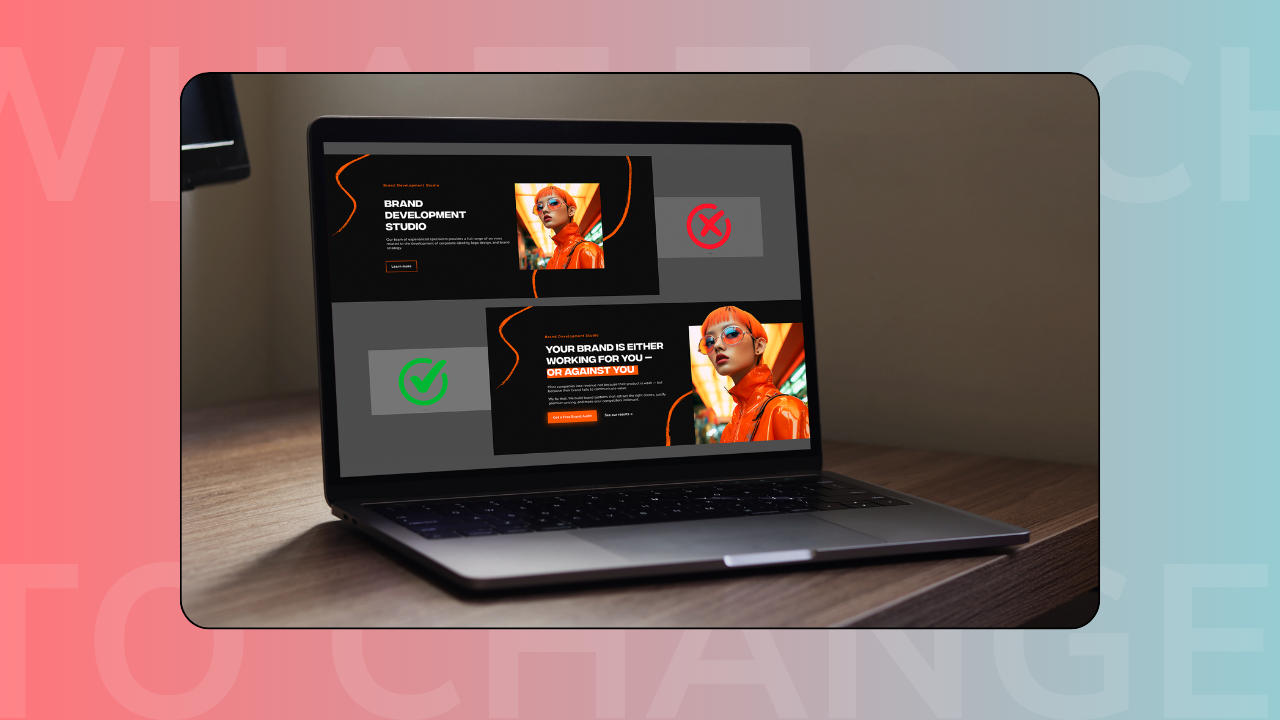
In reality, most sales pages don’t fail because of design. They fail because the message is unclear, the structure is confusing, or the visitor doesn’t understand what to do next.
A good sales page is not about looking impressive.
It’s about making the decision easy.
Your page is not clear in the first seconds
Visitors don’t read your page from top to bottom. They scan, trying to understand quickly if this is relevant for them.
In the first screen, they should understand:
- who this is for
- what problem it solves
- what result they can expect
- what they should do next
If this is not obvious, many people leave before they even start reading.
You are trying to say too many things
Another common mistake is putting too much information on one page.
When a sales page tries to explain everything at once, the visitor gets overwhelmed and stops paying attention.
Instead, focus on:
- one main offer
- one main result
- one main audience
Clarity always converts better than complexity.
The offer is not explained in a simple way
Sometimes the offer makes sense to you, but not to the person reading the page.
Make sure the visitor can easily understand:
- what exactly they get
- how long it lasts
- how it works
- what happens after purchase
If people have to guess, they usually don’t buy.
There is no clear next step
Every sales page should lead to one action.
Common problems:
- too many buttons leading to different places
- no clear call-to-action
- the buy button is hard to find
- the checkout feels disconnected
The page should guide the user step by step until the purchase feels natural.
Trust is missing
People rarely buy from a page that feels uncertain.
Your sales page should include signals that build confidence, such as:
- testimonials
- real results
- clear explanations
- professional layout
- consistent structure
Trust often matters more than design.
The page looks good but doesn’t guide the user
A beautiful page does not always mean a high-converting page.
High-converting pages usually have:
- simple structure
- clear sections
- logical order
- strong headline
- visible call-to-action
When the page is easy to follow, people stay longer and are more likely to buy.
Final thought
If your sales page isn’t converting, the problem is usually not the platform, not Kajabi, and not the template.
Most of the time, it’s the structure, the message, or the flow.
When your page is clear, focused, and easy to understand, conversions improve naturally.
If you want help building or fixing your Kajabi sales page so it actually converts, we can help.
👉 Start your project with Inweba
https://www.inweba.com/start-your-project